![]()
|
|
|
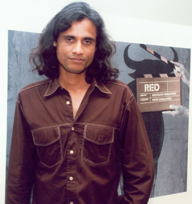
Prasad Raghavan |
|
Prasad
Raghavan graduated in graphic design from the College of Art,
Trivandrum, Kerala, in 1991. He moved to There
are two big differences between mine and the lumiere brothers’ first ever
basement movie projection, though. Unlike the lumieres, I haven’t invented
the projector, nor earned any revenues from my venture. Over the years, this passion has turned into a:door art centre, a trust, founded on may 6th, 2005, at a basement in cr park, new delhi. I show the world’s best cinema every saturday, 7.30pm sharp, to anyone who shows up. (if it’s the world cup finals, please call and check, though.) My posters were an organic extension of my love for cinema. I did a poster on hitchcock’s birds, for the inaugural basement show (I had just moved in); it was awarded at the cannes advertising festival and british design and art direction (d&ad). The awards made me happy, but it was the freedom that I felt doing these posters, freedom from the rigid rules of advertising, that brought me joy. From then onwards, I have been working on movie posters almost every night. I’m more fascinated with the title of the film than the real content of the story. Titles rich in visual meaning like ‘knife in the water’ or ‘thief of baghdad’ let me imagine and interpret the film the way I want to; I let my aesthetic and political voices speak. I’m not bound by a particular technique, I like breaking personal ground, planting new seeds. I like mixing up digital photography, charcoal, typography, photocopies and the internet. I am open to many influences as I travel: the swiss dominance of the poster field in the late ‘50s is an inspiring period; the bauhaus roots, the strong typographic elements, the strict graphic, almost mathematical grid, the black-and-white photography – the “international typographic style”. I like what philip meggs calls “conceptual image”, a new language that borrows freely from surrealism, pop art and expressionism. (a famous example being milton glaser’s bob dylan album design, I forget the name – glaser portrayed the musician’s hair as a rainbow of rich, flowing waves.) Another eye-opener has been wolfgang weingart’s strong graphic style, loosely called ‘post modern design’. Weingart experimented with the offset printing process, and his style of typography was an important foundation for ‘memphis’, ‘retro’, right up to interesting work being made in computer graphics. I have a feeling my posters will change and hopefully evolve, as the internet throws up more common ground between me and cinema. I’m watching.
|
|
||||
|
|
|
||||
 |
 |
||||
|
|
|
||||
© 2002 The Guild. All rights reserved.